Emyr Honeybun Logo
2023
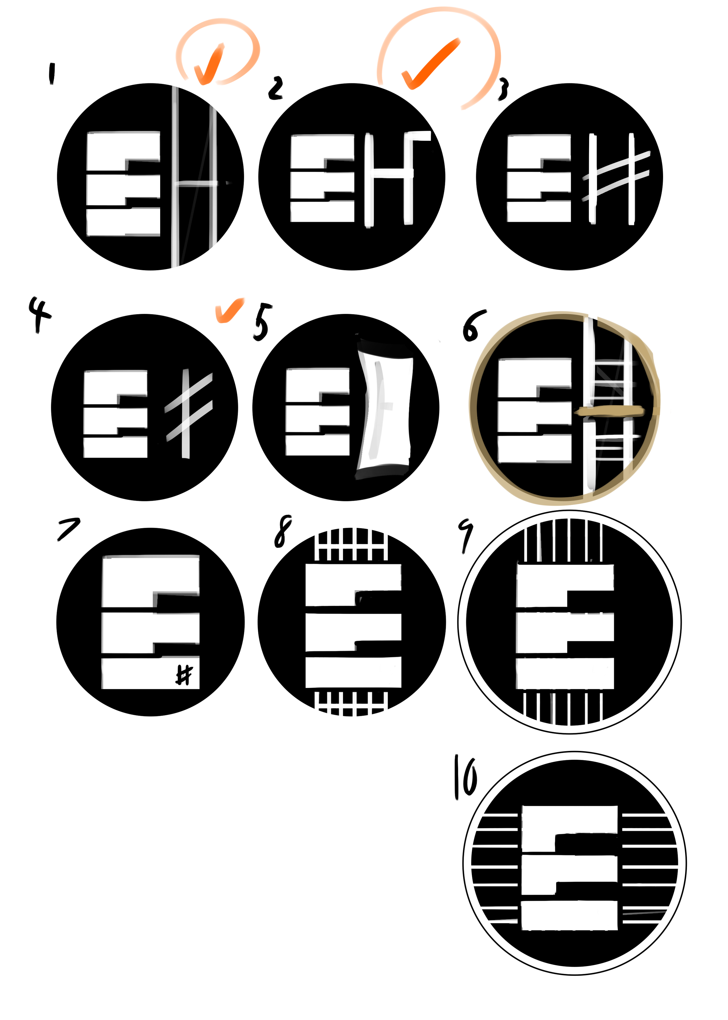
I created the logo for Emyr Honeybun, a music teacher skilled in both piano and guitar instruction. It was important that the design reflects his versatile expertise. The fun challenge was figuring out how essential it was for the client to have the “H’ to reflect his last name. Originally it was to be reflected (multiple times) in the guitar struts and strings behind the piano key ‘E’. We decided to have the strings not be obstructed at all, as the client wanted more attention to the piano keys.
His website can be found here.


Beast Van
2022
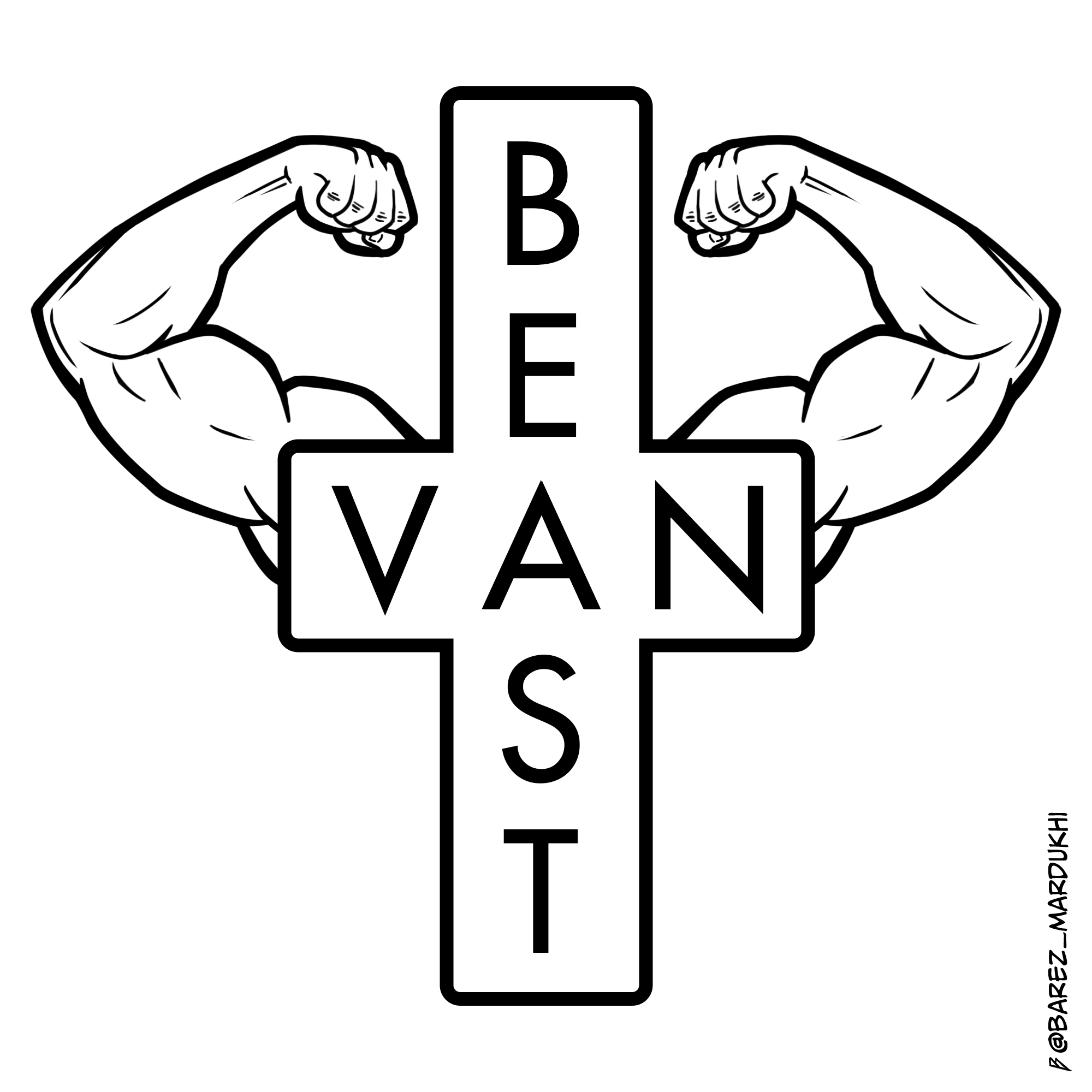
While walking home, I came across the iconic East Van sign and took a quick photo of it to share on my Instagram story. I playfully added a "B" on top to be "Beast Van" and some arm emojis. I thought it would make a great logo, so I worked on it the day after. I searched online to see if the name was already in use and found a couple of brands with the same name, making it less original than I initially thought. Nonetheless, I still loved the name and the design I created and felt compelled to share it.


Summit Music
2019
I created this logo with the intent of featuring a note beam and mountain motif to align with the geographical location of the client's target audience, which are predominantly situated in North and West Vancouver.
If you need music lessons, visit here.


VanSketchClub
2018
Given the MeetUp's purpose of enjoying coffee and drawing, I crafted the logo to feature a coffee cup ring. Upon closer inspection, one may notice the bottom of the ring has a silhouette of The Lions as an easter egg, paying homage to its Vancouver roots.
If you're looking to drink coffee and draw, join the MeetUp here.

Evergreen
Clearly.ca
2014
Evergreen is an environmentally conscious line of eyeglasses. For this logo, I aimed to demonstrate the brand's commitment to sustainability. The frames incorporate recycled plastic, and I wanted the logo to reflect this. I used a gradient from dark cyan to green to reflect this.


Perspective
Clearly.ca
2014
Perspective represented the professional hipster line of eyeglasses. I wanted to create a design that was simple and business-like while still being trendy and stylish. The logo features a clean, modern font to exude professionalism.


Zooventure
Clearly.ca
2014
For Zooventure, I was instructed to incorporate a frog into the design, and I took it as an opportunity to create a fun, playful logo that would appeal to children. I used bright, vibrant colors and a playful font to create a design that is both kid-friendly and eye-catching. Most logos were text-based and horizontal, as they needed to be on the arms. This one was different as it could be circular


